Noisy Nights Illustration Process with Annie White
February 25th, 2021The very talented illustrator, Annie White, explains her illustration process for the book Noisy Nights in great detail. Watch as words come to life through Annie's wonderful drawing skills!
Noisy Nights is written by Fleur McDonald and tells the story of poor Farmer Hayden who is desperate for a good night’s sleep but is kept awake by his menagerie of noisy animals and to top it off - a clattering train. His sense of frustration builds as the chirping, mooing, maaing, nickering and howling continues through the night.
The story appealed to me because most of us can identify with not being able to fall asleep and sometimes it’s because there are annoying noises.
I enjoyed illustrating the emotions and expressions in this story, especially Farmer Hayden’s.
I enjoyed illustrating the emotions and expressions in this story, especially Farmer Hayden’s.
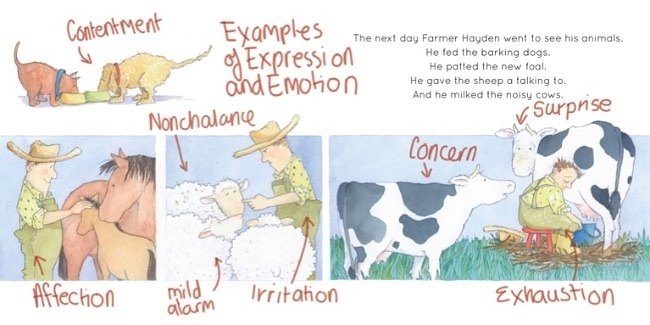
Also, I particularly liked the way Farmer Hayden eventually fell asleep, unwittingly using an age-old method!
Farmer Hayden is probably my favourite character in the book, though I became quite fond of the sheep as well.
Farmer Hayden becomes more and more frustrated as he tries and fails to nod off to sleep, so I felt it was important to show him as a soft and rounded character in order to counteract his crossness.
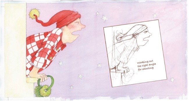
At the beginning of the story the tension only shows in his sleepless face, but as the night progresses exasperation can be seen in his body language as he pulls his nightcap over his ears, muffles the sounds with earmuffs and pillows, scrunches the quilt up to his chin and finally leans out of the window on a ramrod angle of outrage.
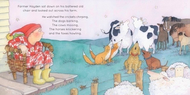
When he resigns himself to defeat, he returns to his soft, slightly dumpy shape as he sits on the veranda in exhaustion.
My Process
I read the text for the first time in a quiet place and scribble down immediate ideas that most people would be unable to decipher (sometimes I can’t either).
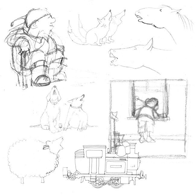
As I re-read the story, I add more ideas and refine the thumbnails into images that other people will recognise and this leads to a storyboard.
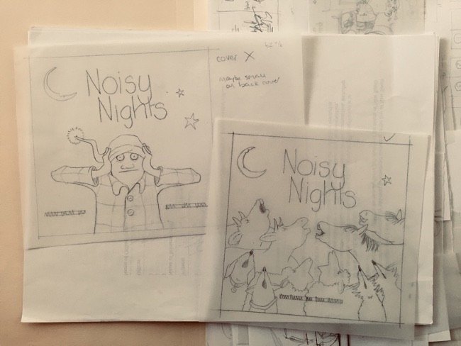
When everyone is happy with the storyboard, I work on more detailed rough sketches and incorporation of the text. I use layers of tracing paper to work out placement and balance.
When everyone is happy with the storyboard, I work on more detailed rough sketches and incorporation of the text. I use layers of tracing paper to work out placement and balance.
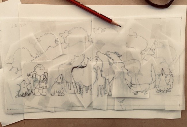
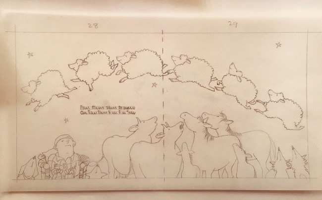
With approval of the roughs, the finished illustrations begin.
For Noisy Nights, I kept the palette in soft tones as, even though emotions run high in this book, it is a bedtime story after all. I decided to show the outside settings in twilight rather than the black of night which also encourages a gentler feel.
For Noisy Nights, I kept the palette in soft tones as, even though emotions run high in this book, it is a bedtime story after all. I decided to show the outside settings in twilight rather than the black of night which also encourages a gentler feel.
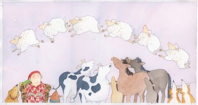
Then the cover.
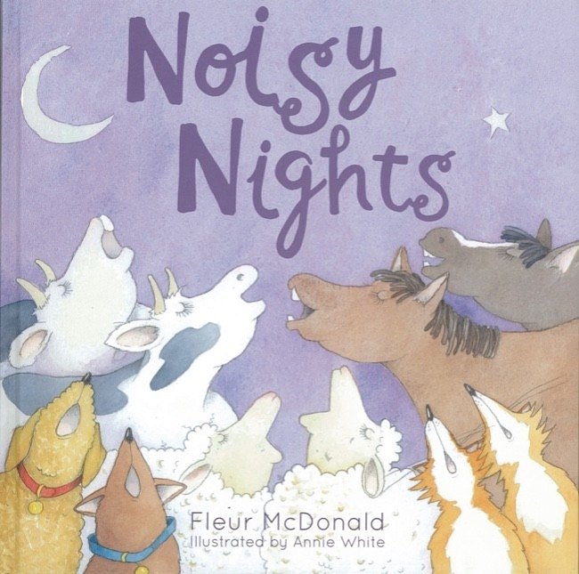
The cover is such an important image. Something to grab the reader’s attention, show a snippet of the story but not give it away.
I like to illustrate the cover last of all as, by the time I’ve come to the end of the book, I feel I’ve really become immersed in the story.
Quite often though, publishers and marketing people like the cover to be done at the beginning for publicity reasons.
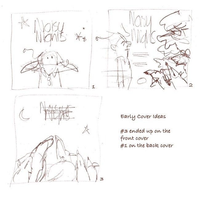
Here are some early ideas for the Cover, one of which ended up on the front and one on the back as a vignette.
Noisy Nights
From bestselling author Fleur McDonald comes her first delightful picture book.A farmer struggles to get to sleep with all the noise from his farm animals. He finally finds the solution to a good night’s sleep.
Order the Book
Comments (0)
No comments have been submitted yet.
Why not be the first to send us your thoughts
Leave A Comment
Thank you for your comments, they will appear shortly once approved.
View by Category
Latest PostsPopular Posts1
Higher Ground longlisted from Carnegie Medal for IllustrationFebruary 10th, 20262
Higher Ground featured in the 2026 Read for Empathy CollectionFebruary 5th, 20263
Ava Spark: Hello I'm Here longlisted for the Spark AwardsFebruary 1st, 20264
Higher Ground nominated for Carnegie Medal for IllustrationFebruary 1st, 20265
Jenny Moore Q & A Pawprint ProductionsSeptember 3rd, 20251
123 Tea Party! The History of Afternoon TeaJune 25th, 20192
Oscar-winning Reese Witherspoon to read Extraordinary!January 27th, 20223
Simon Prescott: The Story Behind Marvin and Marigold: The Big SneezeSeptember 1st, 20174
New Frontier Publishing to Publish Vogue Williams’ First Children’s BookJanuary 27th, 20225
New Frontier Publishing to Partner with WWT (The Wildfowl & Wetlands Trust)January 27th, 2022